← Creative Intelligence

Coursera

EdTechUpskilling🇺🇸 United States·Online courses & certificates·Mountain View, USA
Open in Ad Library ↗
50
Active creatives
98%
Static share
0.3
New / week
421d
Longest run
38
Brushless Fit
AI creative read

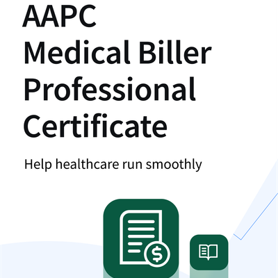
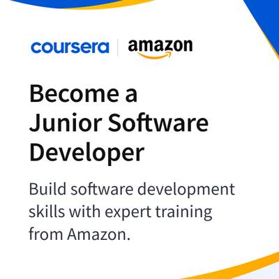
Coursera's US static ads run on a tightly templated design system: Coursera logo + partner logo (Intuit, Microsoft, Google), bold 'Become a/an [Role]' headline, a supporting 100%-online value line, and an abstract swoosh background colored to match the partner brand. Messaging leans entirely on partner-authority and role-aspiration ('Become a Bookkeeping Pro,' 'Become an AI product manager') rather than product demonstration. This is a high-volume, low-variance production model — efficient for scaling co-branded campaigns across many partners/courses, but visually samey and light on proof, testimonial, or product-screenshot content, which a static-creative partner like Brushless could meaningfully diversify.

Themes
Career transformation via professional certificatesCo-branding with recognizable partner logos (Intuit, Microsoft, Google)Specific job-title outcomes (Bookkeeping Pro, AI Product Manager)Certificate-as-proof / credential visualizationAI and tech skilling push100% online / accessibility of learning
Visual style
Bold flat brand-color fields (Coursera blue plus partner accent colors) with organic swooping shapes as background texture; heavy white space for text blocks; large bold sans-serif headline ('Become a...') paired with a lighter-weight subhead; partner logo lockup always paired top-left next to Coursera logo; one variant abandons abstract shapes for a literal certificate mockup held by illustrated hands. Low photographic content overall — this is graphic-design/illustration-led, not photography-led.
Messaging angles
Aspirational identity/role framing ('Become a Bookkeeping Pro', 'Become an AI product manager') · Authority/credibility transfer from name-brand partners (Intuit, Microsoft, Google) · Low-friction accessibility ('100% online') · Concrete deliverable proof (visualized certificate builds trust/tangibility) · Trend-riding into AI/generative AI skilling demand
Language mix
English only, US market
Where Brushless adds value

The template is efficient but visually repetitive and undifferentiated ad-to-ad — nearly every creative is 'logo + swoosh background + headline' with almost no product imagery, learner faces, outcome storytelling, or scroll-stopping novelty. There's a clear opportunity to diversify visual hero elements (learner testimonials, before/after career outcomes, UI/course-platform screenshots, data-driven proof points like salary lift or hiring-partner stats) while keeping the brand system intact. Also room to A/B test more dynamic layouts (bento grids, comparison callouts, stat-led headlines) and to push the certificate-mockup concept further since it's the most tangible, differentiated asset in the set.

Model: claude-sonnet-5

Format mix
Static / image98%
Video2%
Carousel0%
Languages: English · Channels: Facebook, Instagram, Messenger, Threads, Audience_network · Median run 43d
Est. monthly static production spend
$90.0$210.0/ mo
Low confidence
Paid-social static$53.0
Display$30.0
Emailers / CRM$23.0
Landing / web$23.0
Print / OOH$23.0

~1 new static variants/mo × $150/variation (US).

Why it fits

Global learning platform running static certificate/career-outcome creative + promos.

Source: secondary-research-2026-07-03 · High confidence